Design Projects
Take a look at my most award winning projects
Wellness Website
Healestia
Healestia is a wellness platform designed to help people explore alternative therapies and discover approaches that better align with their individual needs and preferences.
The website was designed around a calm and approachable visual direction — soft colors, generous spacing, clear typography and carefully structured content — creating a trustworthy experience while making the wellness space feel easier to understand and navigate. The project covers the complete website experience: homepage, about, benefits, platform introduction, testimonials, FAQ, contact and early-access sections, with a responsive experience designed for both desktop and mobile.


Simplified complex wellness information for easier understanding
Created a calm, trustworthy visual experience to support user confidence
Designed for a consistent, fully responsive experience across devices
E-commerce Shop JoJuices
JoJo Juice is a healthy-drinks e-commerce concept selling cold-pressed juices and energy drinks aimed at a young, wellness-focused audience.
The design leans into an energetic personality — a warm orange-to-red gradient, punchy yellow display typography, and playful annotation-style arrows — to differentiate it from the clean, minimal aesthetic most healthy-drink brands default to.
The scope covers the full shopping journey: homepage (hero, benefits, bestsellers, about, categories), product detail, login, multi-step checkout, cart, and a user profile/account area, all adapted for both desktop and mobile.


Reduced checkout steps to minimize click count and improve conversion
Streamlined checkout flow for higher lead conversion rate
Designed within mobile frame constraints for full responsiveness
TripPilot Dashboard UX/UI Design
TripPilot is a digital travel dashboard built for independent travelers who juggle bookings across multiple platforms — flights on one site, hotels on another, activities somewhere else entirely.
Instead of digging through emails and apps, users get a single control center to view upcoming trips, manage flights and accommodation, plan activities, and stay oriented across multiple trips at once.
The project centered on UX research and information architecture: two personas were mapped (a digital nomad and a family-focused business traveler), translated into journey maps, and structured into five core dashboard sections.


Reduced steps to access flight and accommodation details (one to two taps from any screen)
Pre-filled, validated forms to cut input errors at the source
Empty states redesigned as a discovery/conversion opportunity, not a dead end


Text-heavy content restructured into scannable, varied layouts across the site
Consistent brand identity maintained across 6+ deliverables (logo, email, PDF, ebooks, website, shop)
First full end-to-end branding system delivered, unifying visual identity across all touchpoints
Branding Website Wellness
Cherry Lady Vibes is a full branding project for a wellness coaching service, covering the complete identity system from the ground up: logo, color palette, and typography, extended across an email presentation, a PDF presentation, ebooks, and a full website with an integrated shop and blog.
Unlike the earlier e-commerce and dashboard projects, this one lived almost entirely in brand identity and content design — building a cohesive visual language and then carrying it consistently across every touchpoint, digital and downloadable alike.


Custom illustrated region map integrated cohesively with brand palette
Typography masking and layered photo composition used to differentiate from template-style travel sites
Balanced brown/green color system to avoid unintended "wildlife park" association
Travel Landing Page Visual
This is a tourism website promoting Chiang Mai, Thailand — built to showcase the region's top attractions, cultural activities, travel packages, and traveler reviews in one immersive destination site.
The layout moves through a photo-masked hero title, an attractions carousel, a cultural activities booking section (Thai massage, Muay Thai classes, cooking classes), curated multi-day travel packages, an interactive region map, and testimonials — all wrapped in an earthy green-and-brown palette that leans into nature and heritage rather than a generic travel-brochure look.


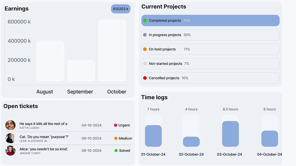


8 key summary metrics surfaced above the fold without visual clutter
Multiple data types (charts, lists, progress bars) unified under one consistent card system
Clean visual hierarchy maintained despite high information density
Saas Dashboard Design
Worksuite is an all-in-one business management dashboard, giving teams a single workspace to track clients, projects, HR, tickets, and finance.
The overview screen alone surfaces a dense set of metrics — total clients, employees, projects, due invoices, hours logged, pending tasks, attendance, and unresolved tickets — alongside an earnings chart, project status breakdown, open tickets list, and time logs, all organized under a persistent sidebar and top-level tab navigation (Overview, Projects, Clients, HR, Tickets, Finance).


One hero, one headline, two CTAs — browsing and ready-to-book.
Four static stats, visible on load, no animation to depend on.
One condensed statement, then six advantages on one card component.
Coffee Repair Shop
Website Redesign
CaffeTehnika (Reparații DeLonghi Timișoara) — a coffee-machine repair shop in Timișoara, redesigned from the homepage up.
CaffeTehnika repairs coffee machines — DeLonghi, Saeco, Philips, Jura and others — in Timișoara. It's a business that already had what it needed to be trusted: over 10 years running, a real client base, a genuinely strong offer. Free diagnosis, free pickup across the city, a loaner machine while yours is out for repair, warranty on every job. None of that came through online.
The old site looked outdated and read poorly — the whole journey felt disorganized rather than guiding someone toward booking a repair. A business this established deserved a site that looked like it.
Sweets Shop Website Design
Dulcele de-acasă is an established local Romanian confectionery. The website was designed to strengthen its digital presence, showcase its products and services, and support the business’s expansion toward events, larger orders and corporate clients.
The visual direction combines terracotta orange, soft pink, elegant typography and generous spacing, creating a premium, contemporary experience while preserving the brand’s warmth and familiarity. The project covers the homepage, product catalogue, individual product pages, events, corporate services, about, gallery and contact.


